A façade sign is like the picture on the cover of a book.
…and as you know, people often judge a book by its cover.
This is because we expect the imagery on the outside to give us a glimpse of what we will experience on the inside. The same is true of businesses. People judge what they might find inside by what they see on the exterior.
The Façade Sign: A Brand Expression
Business owners often come to Ideation thinking they need an exterior sign so people can find them. Of course, they do, that’s part of it, but it’s just a part.
The façade is more than a place to put the logo that’s on your business card. Done right, it’s a brand expression that’s comprised of building architecture, materials, landscaping, messaging, lighting, and, of course, signage. All these elements work together to deliver an intentional impression.
If a retailer has three locations, each with a distinct building architecture, then they should expect exterior signage designed specifically for each building. While more narrowly focused designers might decry brand inconsistency, we believe this presents an opportunity for a brand to be more interesting, respected and relevant. Their customers are going to be moved by the architecture, the colors, the landscaping, the windows, the lighting, and the language.
What Goes into Well-Designed Exterior Signage?
At Ideation, our design process for façade signs revolves around several key elements. These include traditional factors such as:
- Viewing Distance
- Angles
- Local Sign Ordinances
- Brand Identity
- Budget
However, it should also include less traditional factors such as company culture, surrounding visual noise, and landscape design.
Fido: An Oasis in a Visual Storm
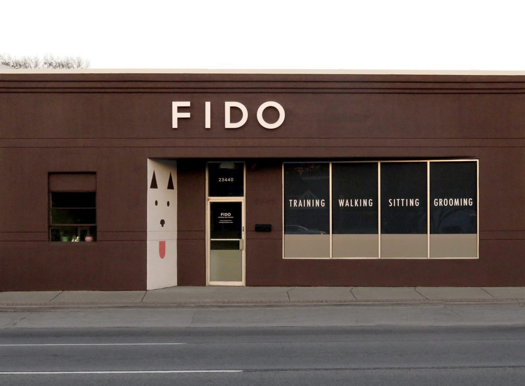
Fido, a dog training studio on Ferndale, opened in existing building with little architectural distinction. Their stretch of Michigan’s busy and iconic Woodward Avenue was rife with visual noise. We needed a way to make them stand out in the crowd of businesses.
Our goal was to make travelers do a double take and for dog owners to smile when they drove by.
The surrounding landscape gave people passing by a bad case of visual overload. So, rather than compete with the noise, we decided to present a simple design to give the senses a rest. People’s eyes were naturally drawn to this oasis in the storm.
We accomplished this goal by painting the façade in a single dark color and presenting the name in a contrasting color. We displayed the name Fido in a simple typeface fabricated with 3” deep steel letters, and a hand-painted mural of the icon we designed.
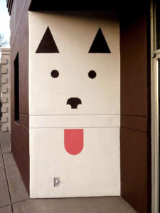
Rarely is just putting an established logo on the front of a building the best solution. In this case, we separated the letters from the dog icon. This allowed us to maximize the size of the letters for visibility while turning the dog image into a separate eye-popping element.
In this instance, the building front had a peculiarity in the shape, with an angled wall adjacent to the door.
“The very abstract image of the dog was designed to reflect the essential elements of all dogs without being breed specific. I wanted to speak to lovers of all dog breeds.” Michelle Lannoo, Lead Designer
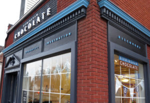
Birmingham Chocolate: a Magical Experience
The objective was to bring a bring out the sense of wonder and magic of this boutique chocolatier in downtown Birmingham, Michigan.
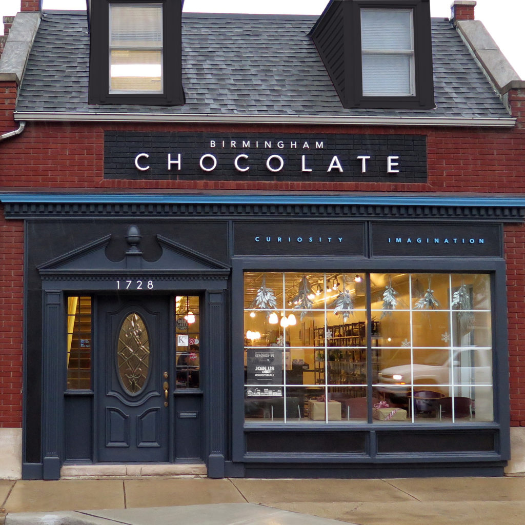
As we considered the design of the store sign, we realized that the existing architecture style contributed to the brand and desired experience. Accordingly, our retail signage played more of an embellishing role.
“While words like artisan and handmade chocolates are true to this product, they’ve become overused words and less meaningful when defining a brand. Instead, we focused on the more magical words of Curiosity, Imagination, Discovery – words shared by head chocolatier and owner, Doug Hale as he was describing his business and approach.” Michelle Lannoo, Lead Designer.
We decided to paint the rectangular-brick inset area behind the façade letters both for aesthetic reasons as well as to maximize the visual impact of the sign. While the previous signs at this location filled that spot in with a traditional aluminum or plastic sign material with affixed letters, this just introduced another unnecessary element to the façade. We felt that in this case, less would be more. The original brick was the original building design and a much more beautiful element. Plus, the city did not consider the painted brick as part of the sign. This allowed us to increase the size of the letters to the maximum square footage allowed.
Motormouth Pediatric Dentistry: Attracting New Patients and Staff
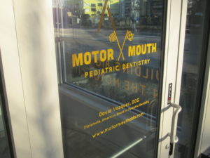 The objective was to brand the exterior of a new pediatric dental practice so that it attracted new patients as well as staff.
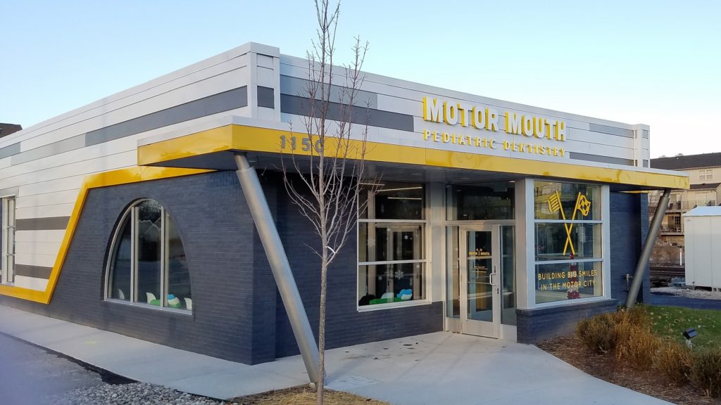
The building was an extensive remodel with a brand new exterior designed by a local architect. With the Motormouth name and theme already in place, Ideation developed a logo and designed a façade sign and other signage to complement the new building exterior. In the first year, the building’s exterior has in fact been a top contributor to both new patients as well as staff.
The yellow returns (or sides) to the letters have unified the sign with the architecture. We accomplished this by bringing in the same yellow color used for the striping on the building. The custom-designed toothbrush and Checkered flag graphic with the message, “Building Big Smiles in the Motor City” applied to the front windows. This provided another element to attract attention while helping to position the business and bring definition to the Motormouth name.
Ideation Orange turns building exteriors and facades into brand expressions. If you would like more information on how your exterior signage can help you achieve your goals, contact Ideation Orange in Hazel Park, Michigan.

