Like all art, signs should tell a story. Musicians, writers, and dancers interpret ways to communicate ideas and emotion through their medium. Despite the subjectiveness of the end product, all ‘art’ has core elements. Together they form the foundation of the piece. For instance, music relies on a fixed scale of notes. Writers manipulate a language made up of words. Designers, like Ideation, rely on basic elements and principles of art. For example, Ideation set out to design a donor wall for the Detroit Institute of Art, which incorporated several essential elements of visual art.
Elements of Art Used to Design a Donor Wall
All visual art starts with seven key elements. An artist takes these items and manipulates them to tell a story.
- Line
- Shape
- Form
- Value
- Space
- Color
- Texture
 The Not So Simple Line
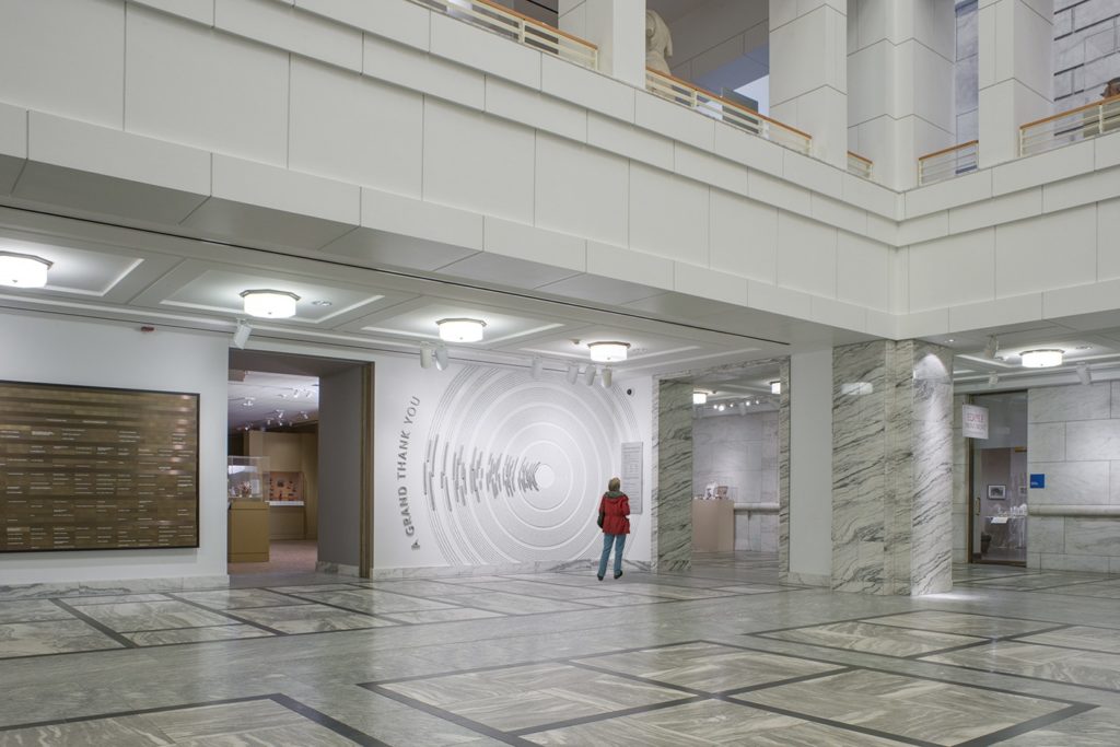
When Ideation was asked to design a donor wall for the Detroit Institute of Art, the resulting piece was one that told the story of the ‘Grand Bargain.’
It began with a concept developed by DIA designers, Everett Keyser and Serene Arena. The concentric circles in the concept circles represented the ripple effect of the Grand Bargain that will be felt in the community for years to come. Ideation’s role was to help bring this concept to life-solving questions related to colors, materials, finishes, dimension, fabrication techniques, sizing and ultimately, the installation. – Michael Garavaglia, Ideation Project Leader
There is a theory that the types of lines used in creating art inspire different emotional states. For instance, horizontal lines convey restfulness; vertical lines convey spirituality, and curved lines convey movement and humanity.
The curved lines, or circles, used by the graphic designers played a big role in telling the story while also conveying movement and providing a contrast with the mostly linear shapes in the same environment. This contrast and movement interrupts patrons in the common courtyard, drawing them in for a closer look.
 Three-Dimensional Form Adds Depth to the Donor Wall
‘Form’ is an element of art that includes height, width, and depth. Cubes, pyramids, and cylinders are basic examples of the use of form in art.
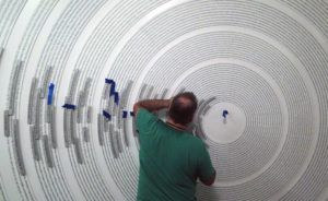
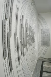
We added layers of dimension and depth to the display, including 3/8″ thick curved plaques for the donor names. The donor names appeared to float right off the wall by using hidden stud-mount attachments with a stand-off. The bottom layer of textured “ring panels” had pre-aligned placement holes to serve as a precise placement pattern when installing the top layer of donor panels. – Michael Garavaglia, Ideation Project Leader
The three-dimensional effect of the floating names drew attention to the importance of the donors. Without their contributions, the Detroit Institute of Art might have forfeited its valuable art to fund the City’s bankruptcy.
Adding to the Story with Texture
Texture is an artistic element used to add depth and dimension. The texture can be physical – discernible by touch, or visual – the illusion of having physical texture. Texture combined with the other elements can convey emotion and messages. Soft, smooth and rough when combined can be used to create contrast or emphasis.
The donor wall at the Detroit Institute of Art used a variety of textures – some visual and some physical. The concentric rings mounted flush to the wall with a 1/4″ thickness were painted a soft, matte white finish to match the color of the wall while the raised characters in these rings were given a brushed aluminum finish. The low contrast of the rings against the wall subtly symbolized how each donor rose from within the institution. The donor names that were floated from the concentric rings were aluminum with a non-directional random orbital finish. This finish uniformly reflected light from all viewing angles while providing a contrast against the soft white background, bringing emphasis to the individual donor names.
If a piece is an artistic work and not just a ‘sign,’ then paying attention to every single detail is important. As one person at Ideation said, “Sweating the details is one of our core values, and this project gave us plenty of details to sweat.”
Move Your Clients With Art
The value of signs and donor walls extends well beyond their functional need of telling a viewer which way to go or in the case of a donor wall, recognizing a donor. It’s in their ability to move people, to make them exclaim “wow!” to make them pause and pay attention, to make one feel they’re in the right place, to tell a story that influences beyond the moment one stood before it.
According to Ideation President, Daren Bossenberger, “artistic donor walls use design not just to recognize donors, but to draw people in to experience a story, a story in which the donors were the main characters. The design should help tell the story.”
There is no reason your indoor and outdoor signs can’t be both functional and artistic. If you need to design a donor wall or you are looking for a Detroit graphic design and sign company, then call Ideation Orange. Our goal is to help you move your customers, both physically and emotionally.


