How can a church communicate who they are and what they believe through signs and architecture? One way they can share what they stand for is with environmental branding. Environmental design marries various elements including graphic design, construction, and landscape architecture. Environmental designers also concern themselves with the visual aspects of wayfinding. They communicate brand identity through signs that complement the design of the church building and their signs deliver many different messages to the people who walk the halls.
Environmental Design Tells a Story
A congregation identifies strongly with its church home. Often the very architecture of the church can give visitors a sense of what they will find inside the walls. Is it a conservative church? Will they speak a traditional message? Are they more contemporary? After all, you would not expect to walk into St. Paul’s Cathedral and find wayfinding signs sporting a Comic Sans font. Even if you did not understand why it felt wrong, your brain would still pick up on the lack of design cohesion.
Not only do signs say something about the church as a body but they also communicate the message of the church. You would not want to trivialize the spoken words by using imagery that does not strengthen what is taught. This is why wayfinding signs and environmental graphics are so vital. Environmental graphic designers take all of this into consideration when designing custom signs for churches.
Blending New Signs with Old Architecture
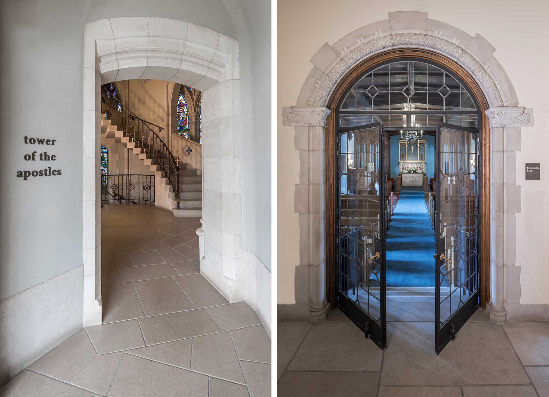
A perfect example the how signs play an important role in the ‘feel’ of a church is Kirk in the Hills Church. One of the challenges presented by church officials was to create a sign plan that worked with their existing architecture. Kirk in the Hills contracted the Environmental Design team at Ideation to create a wayfinding system that preserved the ‘feel’ of their church.

At Kirk of the Hills, everyone wanted to preserve the architecture’s role in establishing the church’s brand identity. Several of the areas of the church were of particular importance. The entrance to the original chapel and the Tower of the Apostles required just the right signage to preserve the sense of respect that the rooms themselves commanded.
A Classic Message and a Modern Church
Other churches may not have the Gothic architecture of Kirk of the Hills, but their need to move people both physically and spiritually was the same.
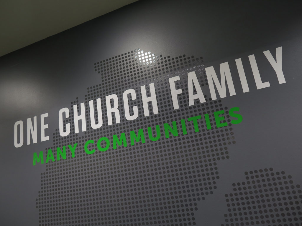
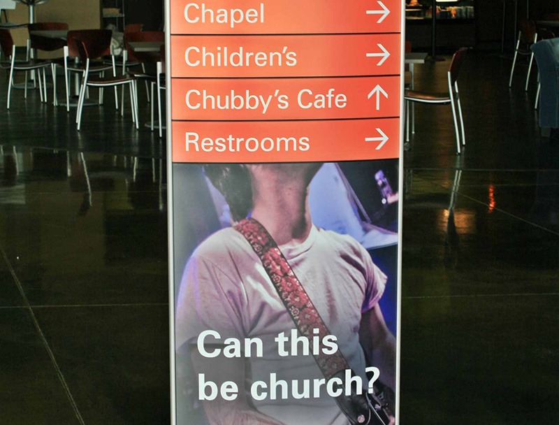
For instance, the Kensington Church Campus in Troy MI gives us an example of how two churches can share the same message in different ways. Yet, just from the signs, one knows that the ‘feel’ of the churches is different. That is what environmental design is about.
Signage for Environmental Design
Many people know that visual content is a valuable tool, but not many know why it’s so important.
Data shows that images reach an individual’s brain faster than textual information or audio. In fact, a person’s brain is programmed to recognize and make sense of visual information more efficiently.
If you consider body language, traffic signs, maps, facial cues, and advertisements, then it’s not hard to see how we have adapted to visual cues.
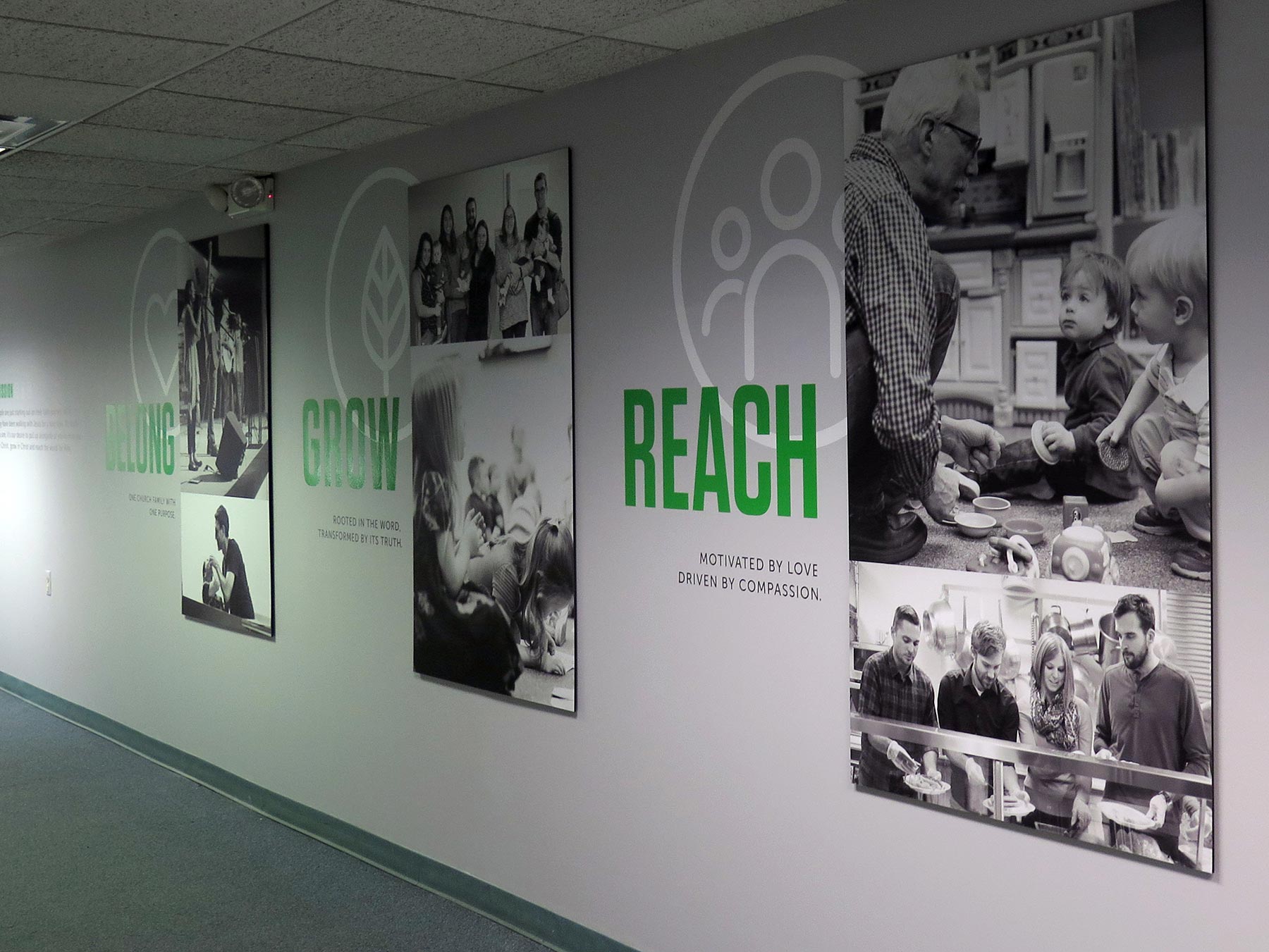
Knowing this, environmental graphic designers produce many different types of signs for churches. These visual cues help reach people faster and easier. This could even be in the form of a story wall like the one at Woodside Church in Royal Oak MI.
No matter what your church building looks like or the feeling you hope to convey, environmental designers like those at Ideation can put together a sign plan that builds a brand identity for your church.
Too often, companies spend a lot of money on new signs without considering the role their brand identity can play in their space.
– Daren Bossenberger, Ideation Founder
Ideation Orange works with churches in Michigan, across the United States, and around the world. If you are interested in how environmental design can help you created branded space, contact Ideation Orange for a consultation.

