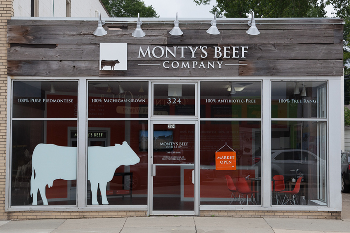
When asked to brand the new flagship retail location of Monty’s Beef, Ideation Orange’s Michael Garavaglia started at the farm! He needed to tell people about this provider of Piedmontese beef originating from the Italian Alps. So, he incorporated pieces of their story into all the design elements and used a mural and other graphics. This visual identity created intrigue and drew the attention of pedestrians.
According to Mike, “it was mission critical to understand the story behind Monty’s Beef. We needed the story to shape an experience that would intrigue, educate and sufficiently tempt both shoppers and those walking by.” Monty’s Beef offers a direct, farm-to-fork beef that is 100% pure Piedmontese. This premium breed of beef is rich in flavor but with a fat content that rivals chicken.
Creating the Brand Identity
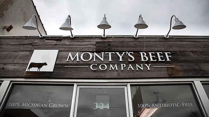
White Oak from the mid-Michigan farm where the herd is raised was used on the exterior façade to convey the farm-to-fork authenticity, with anodized aluminum lettering providing a natural sharp contrast. A nearly life-sized cow silhouette from the logo brought to the exterior glass created a “double-take” moment for those traveling by and was just plain cool. The exterior also communicated a simple message.
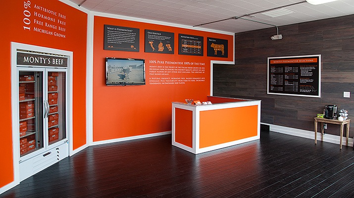
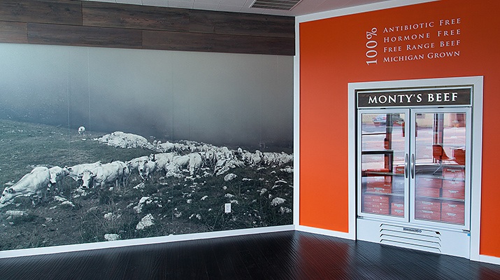
In the interior, Yellow Pine, aged with a wire brush and an oxidized stain, created the right look. A mural produced from a photograph of the Piedmontese stock in the Italian Alps went up on the wall. In addition, custom designed infographics helped narrate the story of the beef. A color palette of bold orange, wood tones, white and black reinforced brand colors and allowed even product packaging to play a role in the environment.
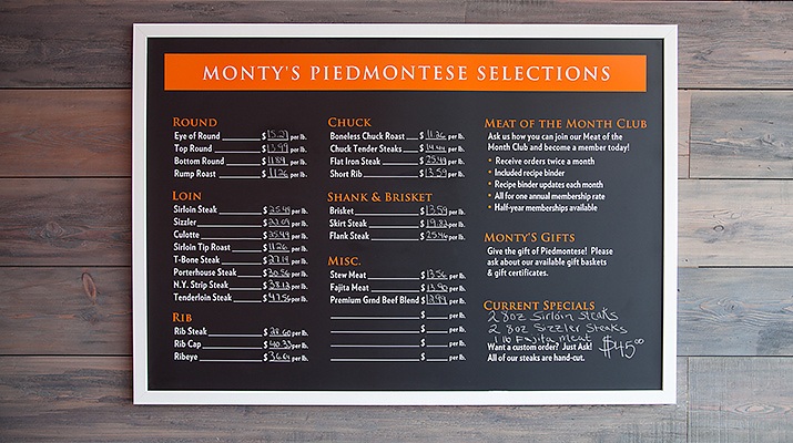
A custom but flexible menu board allowed for easy additions and changes.
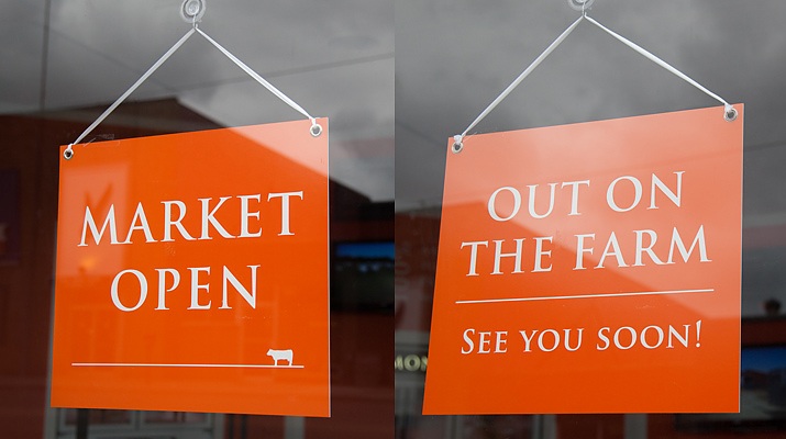
Open or closed? Not really, the Market is open or they’re back to the farm!
For more information on Monty’s Beef visit montysbeefco.com

