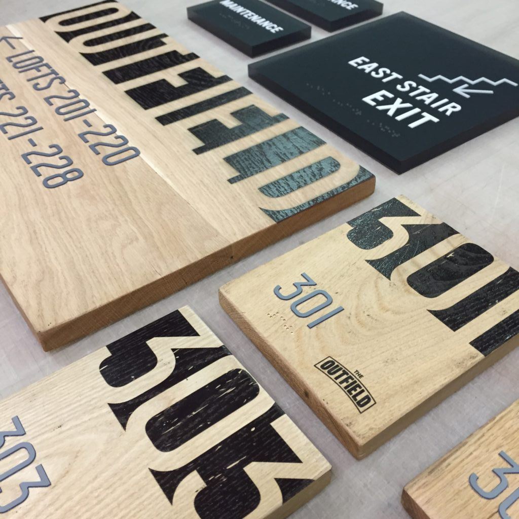
Ideation was asked by Gillespie Group to design and produce custom signage for their new loft style apartments overlooking the outfield of Lansing’s minor league ballpark, home of the Lugnuts!
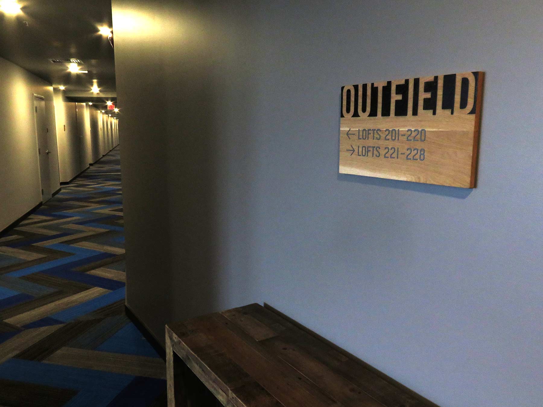
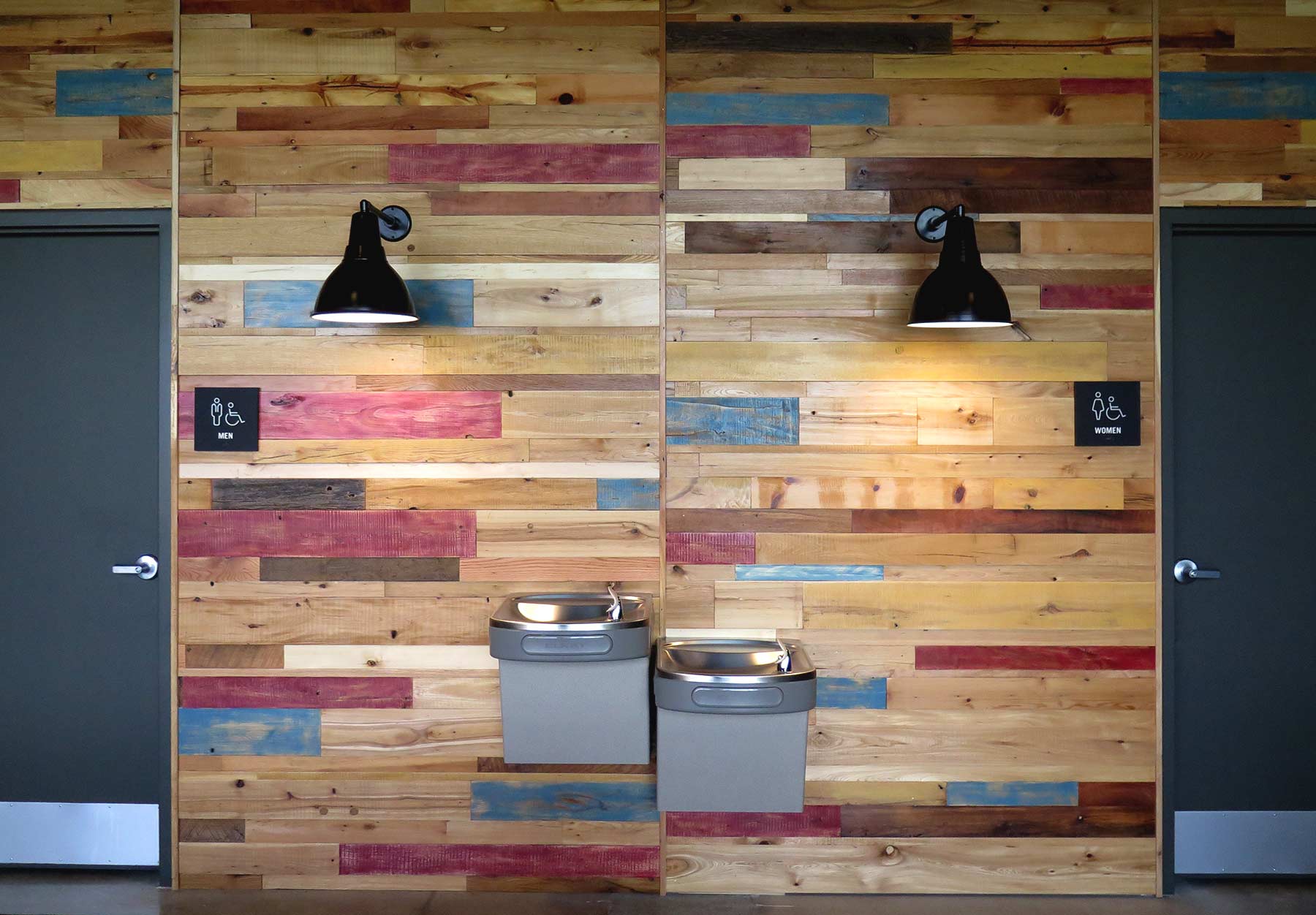
According to Ideation’s Jon Moses, “the interior design had a rustic modern feel with reclaimed wood used throughout the space. We wanted the wayfinding and room identification signage to be an extension of the overall design rather than just a functional necessity. Our goal was for the custom signage to help brand the space.”
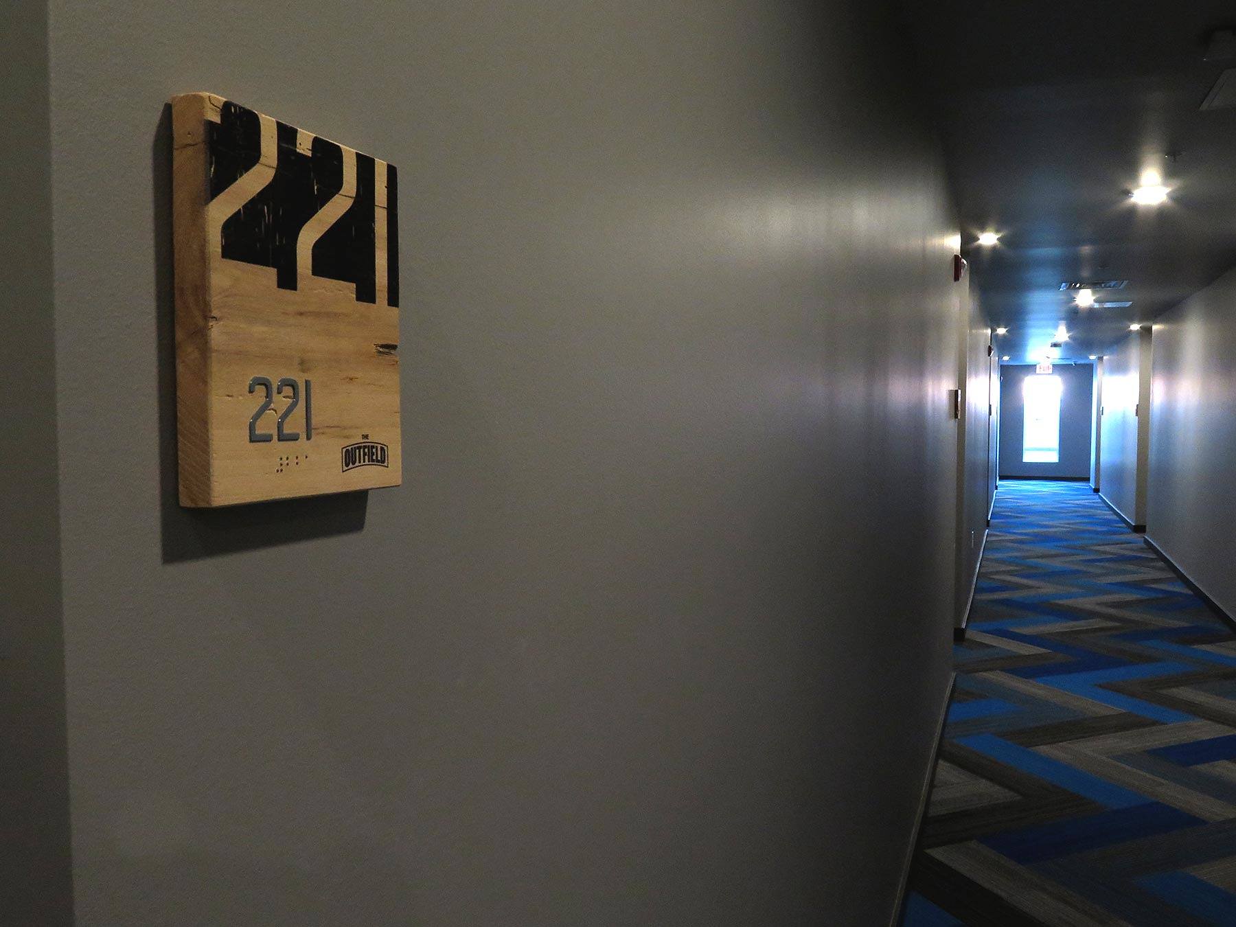
Room identification signs produced from reclaimed wood with direct-to-surface printed graphics and applied raised lettering and Grade 2 braille.
“Rather than fake the wood look with traditional sign laminates, our team wanted to use the same imperfect, reclaimed wood used for common area wall surfaces. After several prototypes, everyone was very pleased with the results!” Jon Moses, Ideation.
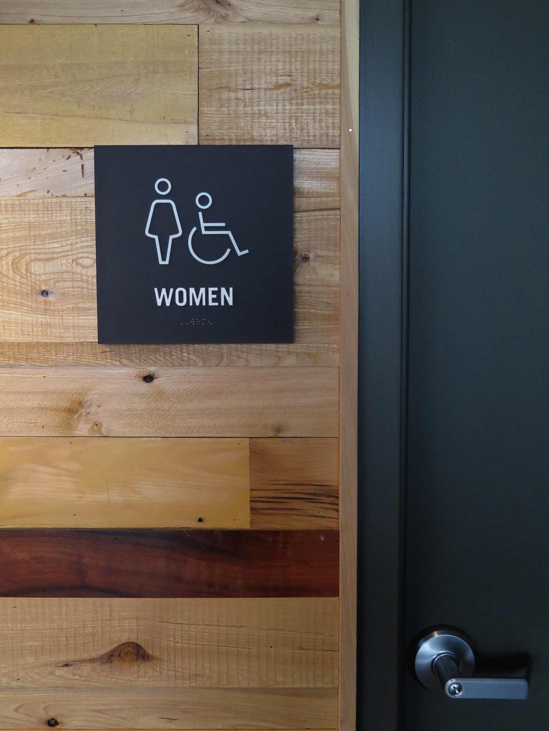
A second complementary style sign was designed and produced from frosted black acrylic for walls with wood background and for utility signs to help balance the overall sign program cost.
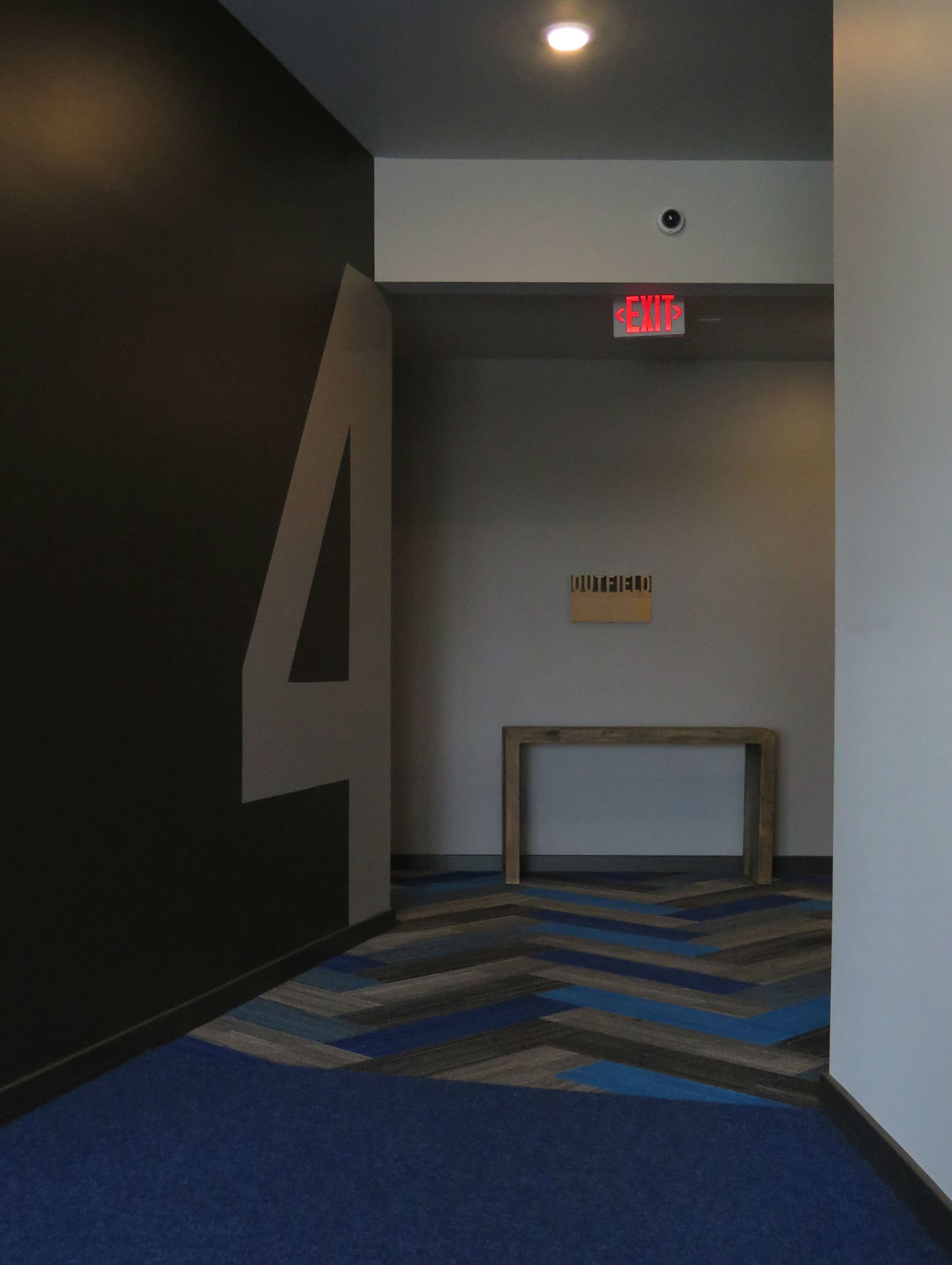
Nine foot tall floor numbers were hand painted to walls outside the elevator doors.
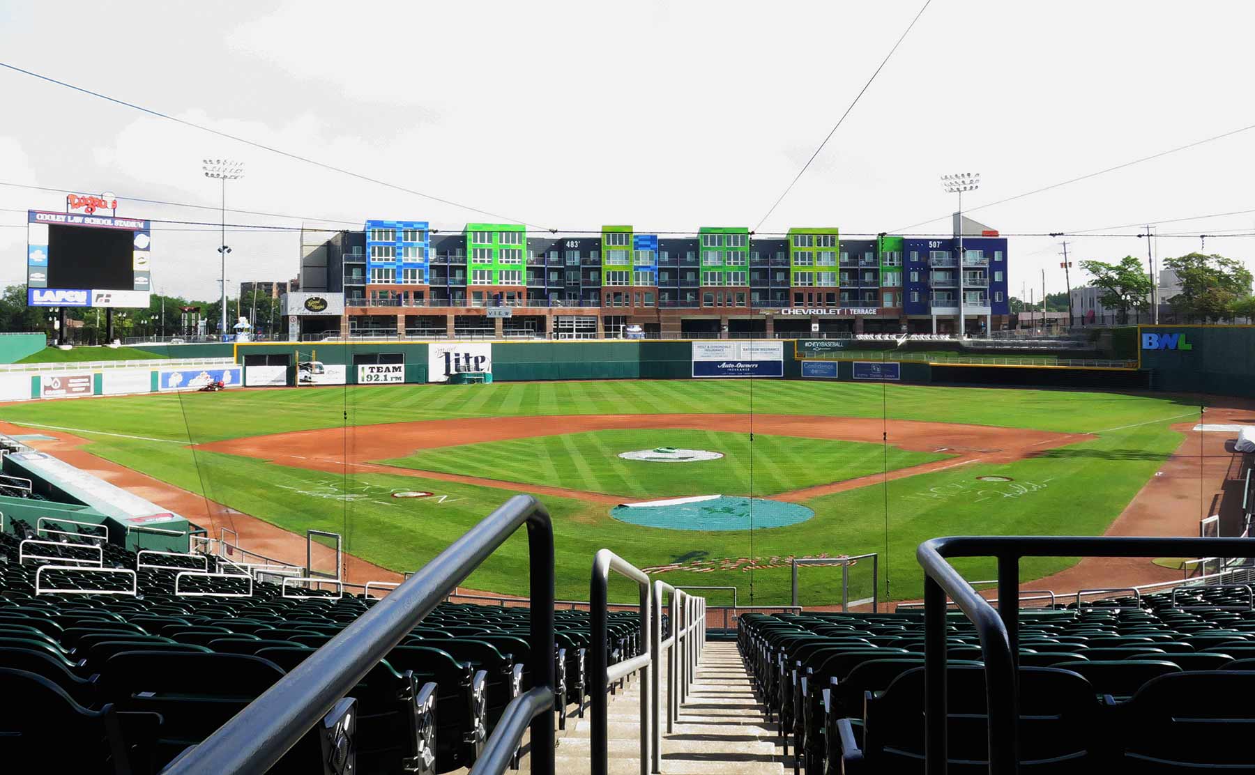
A view of the outfield lofts from behind home plate.
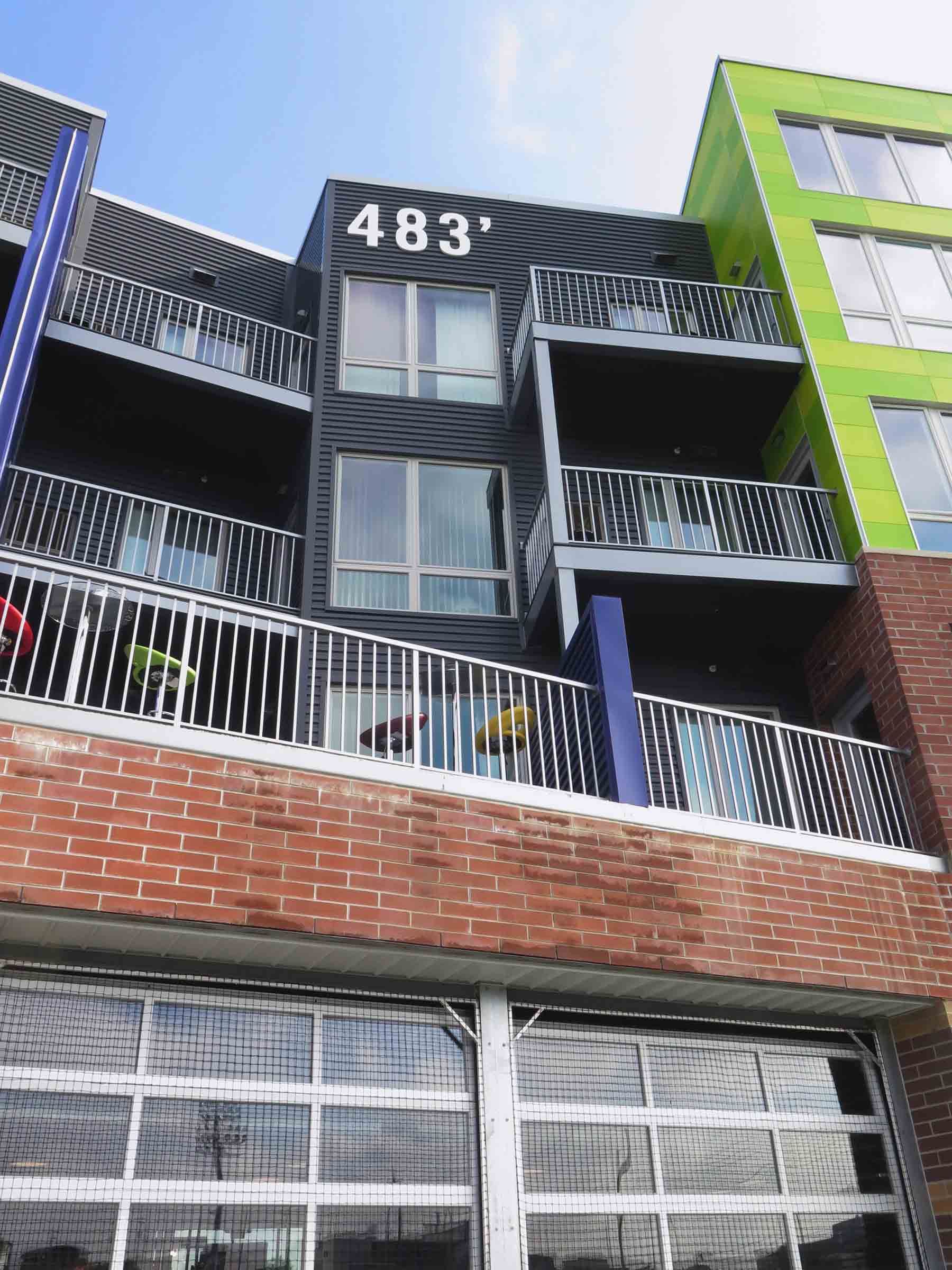
3’ tall steel numbers were fabricated to recognize the distance from home plate to the exterior of the lofts.
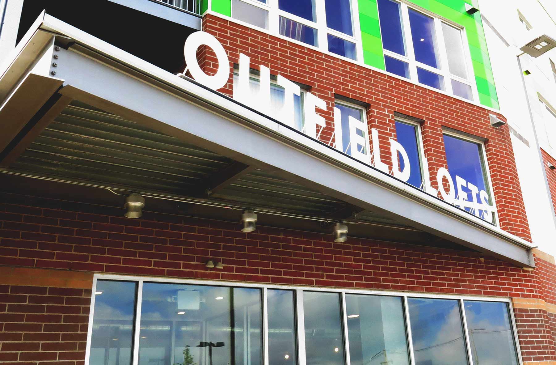
The exterior main entrance was branded with freestanding ½” thick aluminum letters above the canopy.
“Beyond the traditional value of making sure people know where to go when visiting and being an ADA compliant solution, our design added value to the environment by serving as an artistic element. Our goal was that the custom signage and environment would make residents proud to live there and visitors want to live there.” Jon Moses, Ideation Orange.

