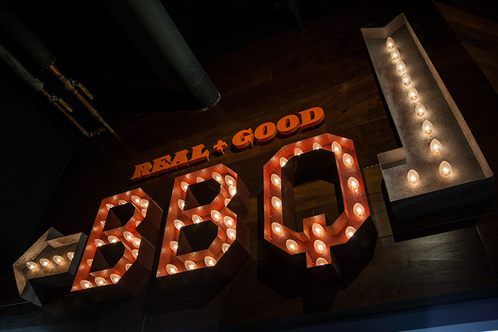
The owners of Holiday Market turned to Ideation Orange to help craft a visual identity and in-market experience. They wanted to brand a new authentic and premium barbeque offering in Metro Detroit. Of course, we leaped at the chance. After all, who wouldn’t want to research this project? So, to gather inspiration, we toured barbeque joints and restaurants across the United States.
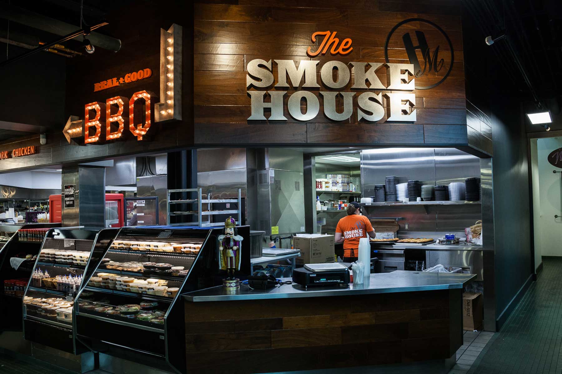
Creating a Visual Identity
Ideation’s creative director Jon Moses and the design team started by developing a simple logo. It needed the elasticity to work in applications ranging from in-market signage, packaging, bags and also apparel. Mood boards, image studies, and renderings of signage validated the look and feel. A little southern personality and grit furthered the theme through a collection of down-home claims.

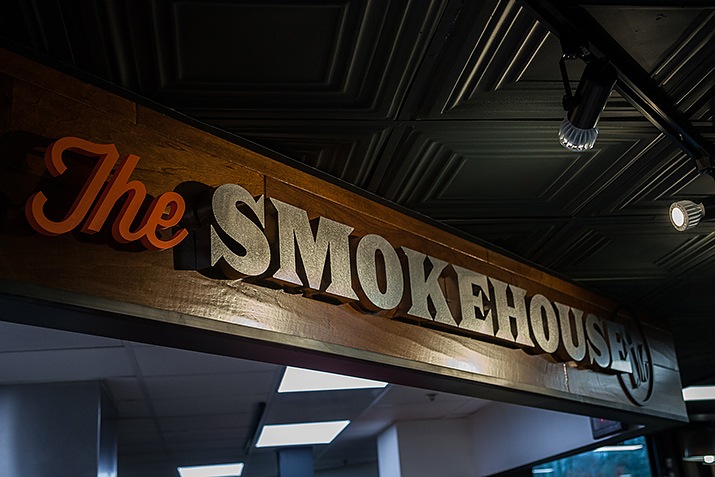
Ideation collaborated with the architectural team at Krieger-Klatt to shape an environment that communicated this new visual identity. Michael Garavaglia of Ideation led the execution of the in-market experience. The visual identity included a weathered steel sign with exposed bulbs to introduce an authentic, retro feel.
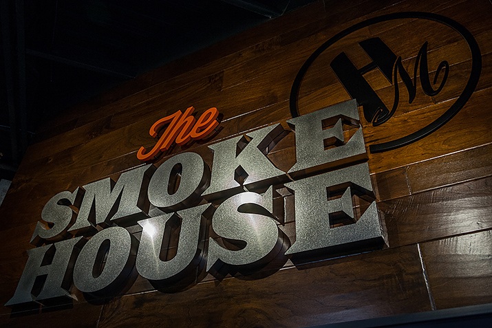
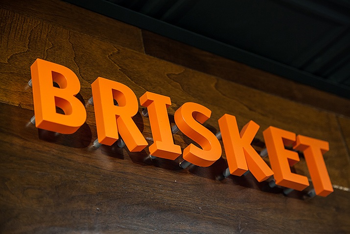
Fabricated steel lettering with a special vibration finish and a branded “HM” logo were used in high contrast to a chestnut brown stained wood background. This created a modern feeling that extended to other parts of the market. By incorporating the look throughout the restaurant we were able to brand the space.
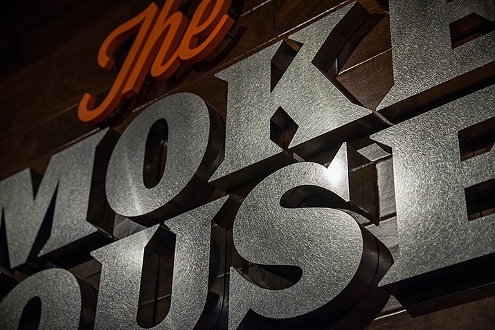
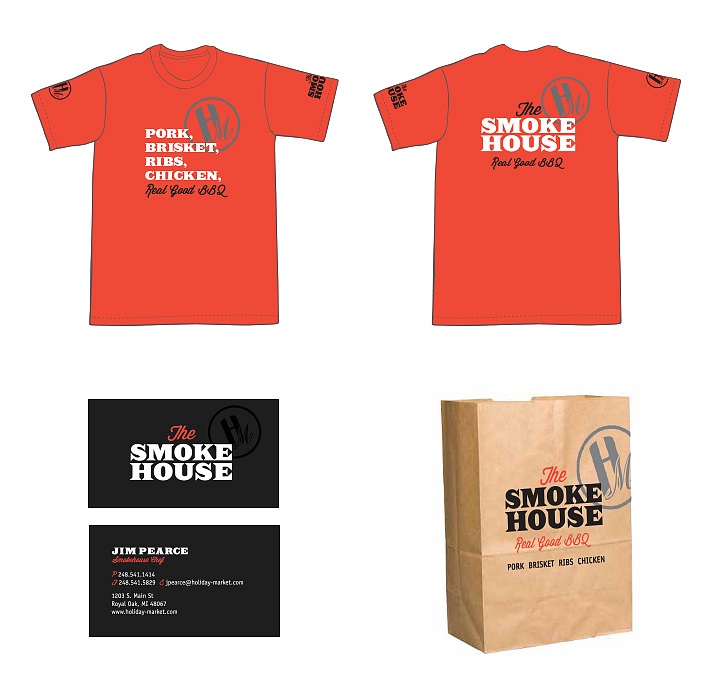
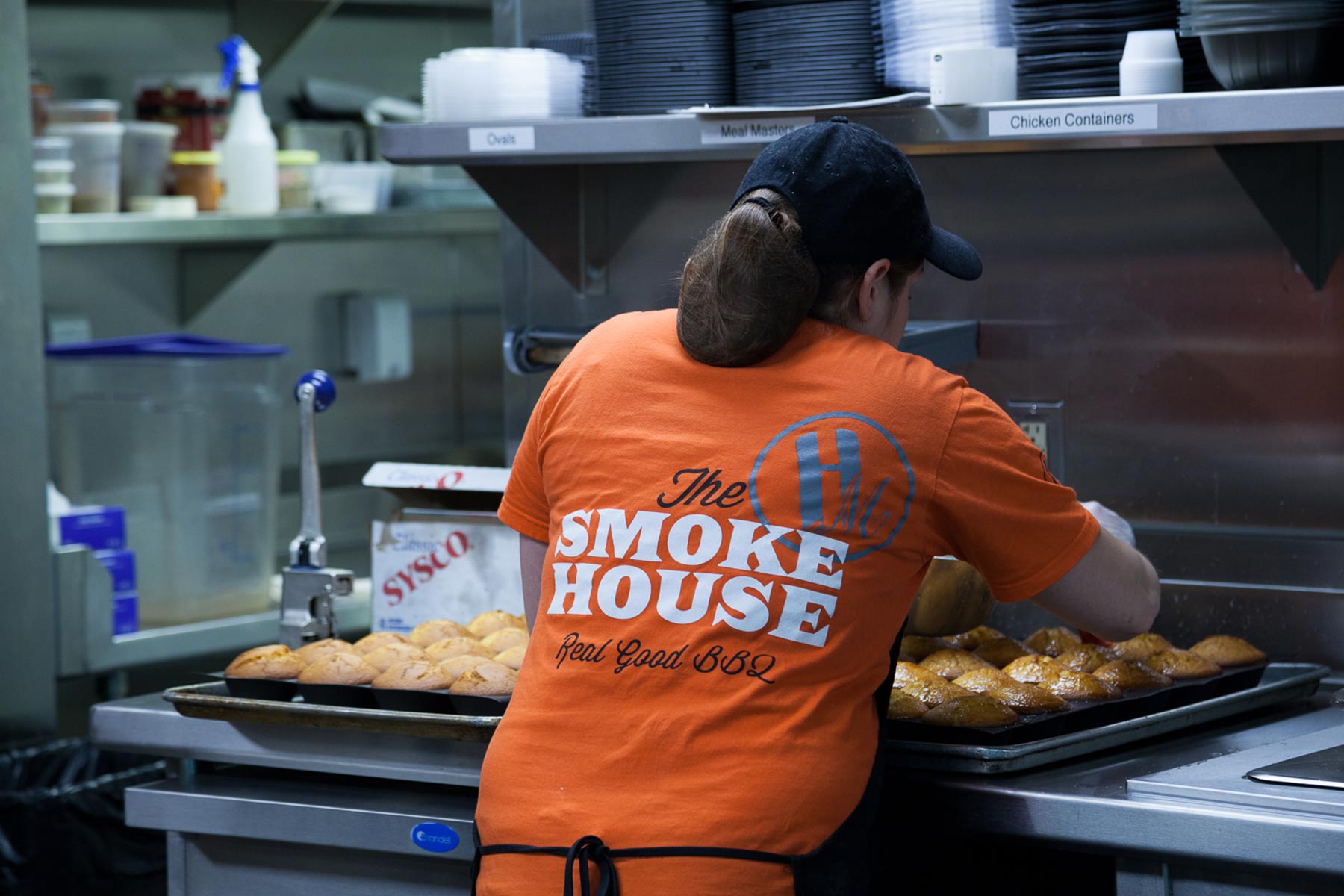
Finally, Ideation Orange designed collateral materials such as printed menus, business cards, and employee t-shirts. We also created a style guide to help them maintain brand consistency over time.
Ideation Orange helps businesses brand space and create brand identities. Contact us for more information on how you can tell your story using graphics.

