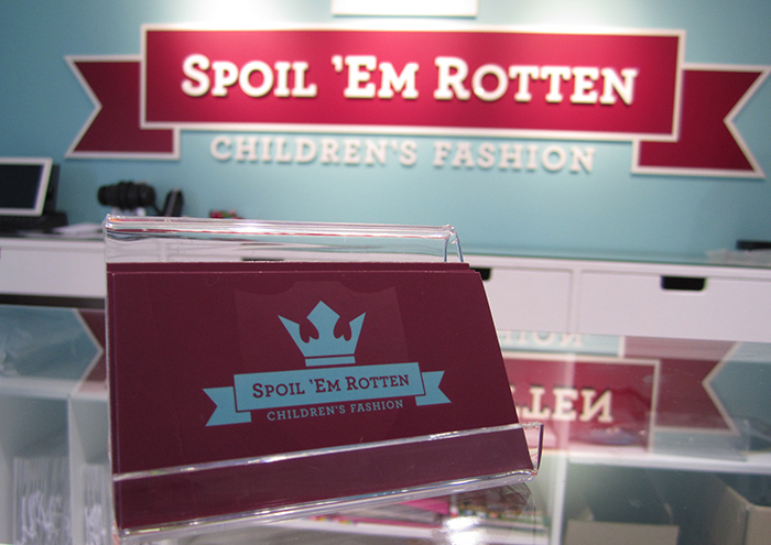
The invitation came from the founder. Could we help extend the brand identity into branded space at a new boutique children’s clothing store called Spoil ‘em Rotten? We really liked the name, so we said yes.
While the name is a bit “tongue in cheek,” the goal was to claim you would find something special inside. What would be inside? Fashionable clothing for both girls and boys and a shopping experience for adults that was fun.
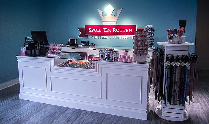
The Ideation Orange team started the transformation process with the logo. The first thing they looked at was the color palette. By Shifting from purple to raspberry, we brought a millennial-twist on royalty. The colors injected more energy into the space. The light blue tone worked with the raspberry to reinforce the unisex offering. The end goal was to make the boys feel comfortable!
Using Environmental Graphics to Create Branded Space
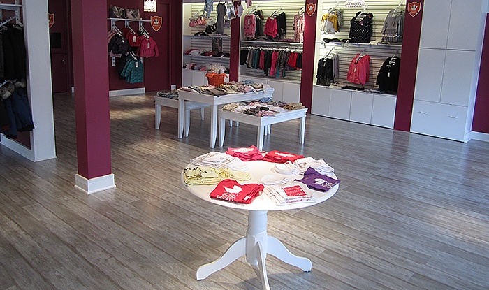
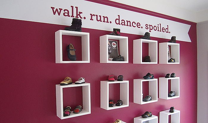
Ideation brought out the brand’s identity and personality in the space with language, environmental graphics and display ideas.
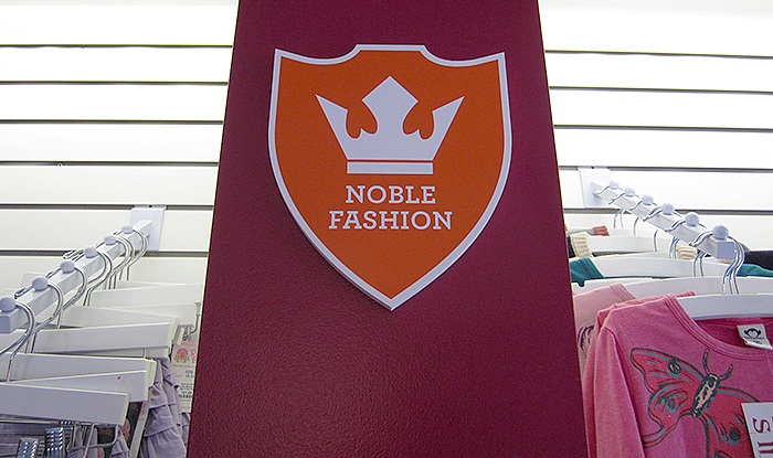
Noble signage created with simple, custom routed shapes and 1-color applied vinyl. All of this help create a branded space.
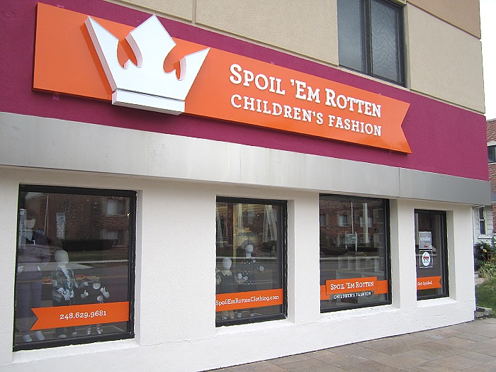
Exterior façade signage and window graphics were designed to maximize impact considering local sign ordinance restrictions. Illuminated letters and crown graphics on the façade sign resulted in striking nighttime visibility.
“My customers loooove my space! I imagined how I wanted my store to look and Ideation Orange made it come to life It was past what I expected!” –Shay Van, Owner, Spoil ‘Em Rotten

