Client: “Can you come up with a large portable graphic? It must measure 29’ long and 8’ tall and we need to suspend it in the air for people to write on it?”
Ideation Orange: Yes, we can.
Client: “Could it break apart into (9) pieces that we could take to different locations?”
Ideation Orange: Yes, it can.
Client: “Can we have it by Friday?”
Ideation Orange: Yes!
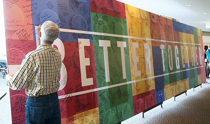
photo by Terry Sykes.
Uniting People With a Portable Graphic
It started with this image and a call from our customer, Woodside Bible Church, a multi-site church with 9 campuses across Metro Detroit.
A new message series entitled “Better Together” was being kicked-off in tandem with their Annual Celebration. The goal was to give each campus a piece of the portable graphic on Sunday morning, inviting congregants to write on the graphic, things they were thankful for.
By Sunday evening, all pieces would end up at the Troy Campus. They were fully assembled in time for the Celebration Dinner.
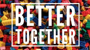
Team Ideation quickly engineered a solution using ½” thick foam board. We cut nine pieces in the shape of rectangular Lego pieces. Each of these would easily but securely interlock into one large portable graphic.
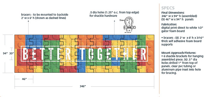
The Better Together image provided by the client worked great for their programs and web site, however, it’s resolution would not hold up at 29’. Ideation’s design team fixed this with a scalable image with lighter colors that would provide sufficient contrast for the hand writing to come.
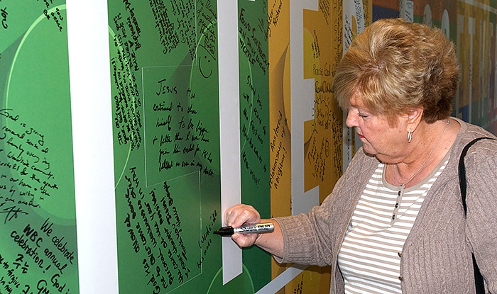
photo by Terry Sykes
By printing direct to the foam board, we had a surface where people could write. A flat-bed CNC router precisely cut individual pieces in the shape of rectangular Legos. We made sure to construct each one with tight tolerances for a secure final assembly.
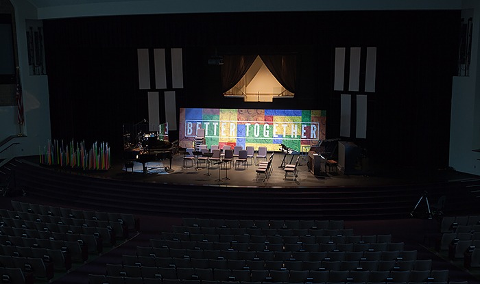
After Thanksgiving, the church used the graphic as a stage backdrop.

